When I first sat down to write my graphic novel script, I realized I didn’t know how many panels to put on each page. How many was too many? Too few? A quick study of my favorite graphic novels revealed patterns that helped me with my first script.
But once I started drawing out the thumbnails, I could see that while my guesses were pretty good, there were cases where I needed to add or subtract panels on certain pages, and I dreaded the snowball effect that would have on my entire project.
So, let’s break it down and really understand how pages and panels work. That way we can write the script with confidence.
Layout
The difference between an illustrated novel and a graphic novel is the layout. The pages and panels are the structure of a graphic novel layout. I know a lot about the layout of prose novels because I design and format for my classic book imprint.
It’s an invisible art that makes reading physically comfortable. If it’s done poorly, the reader might know that they don’t like that edition but not know exactly why. For graphic novels, ease of reading is even more important because it can cause confusion and a confused reader will stop reading. But more than that, the layout design of a graphic novel is a narrative tool.
It influences pacing, mood, tone, setting, etc.
The layout consists of pages, panels, dialog, captions, and sound effects.
Pages
Every page of a graphic novel has one primary beat. This is the focus of the page and can be a conversation, an action, or an emotional payoff.
Page Types
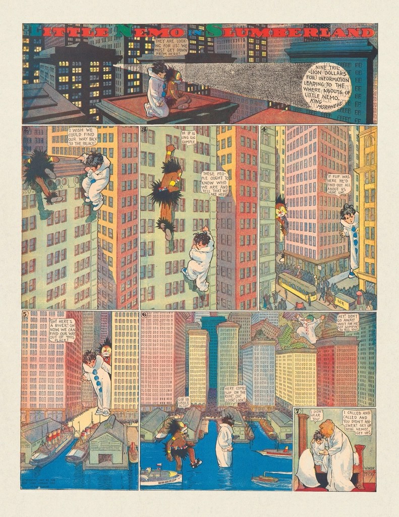
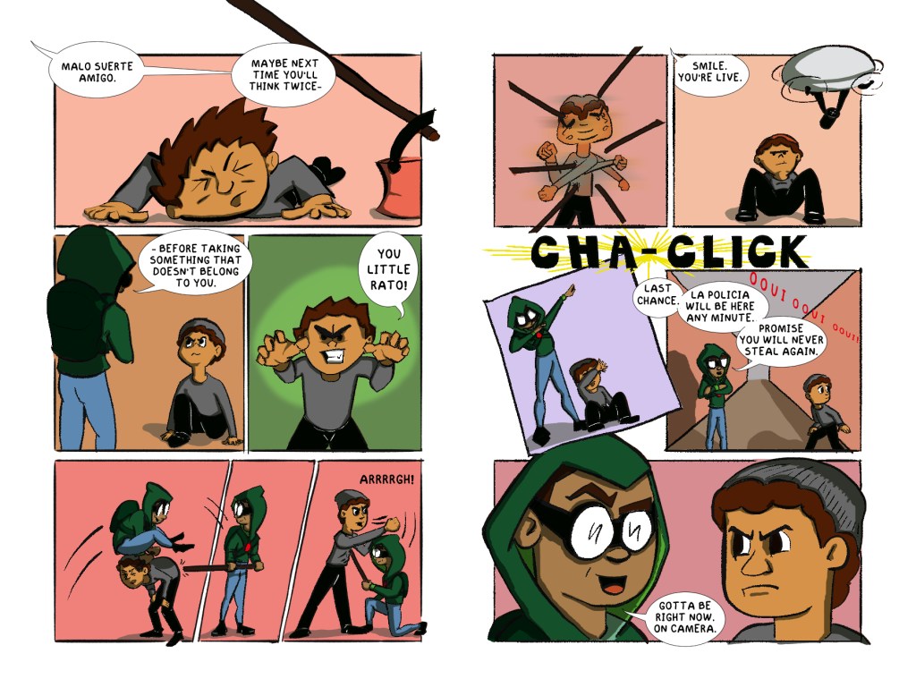
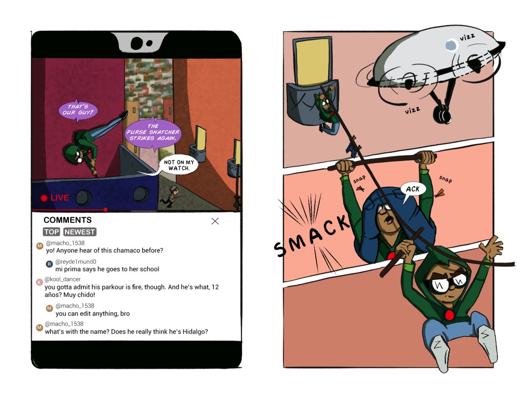
There are many different ways to arrange the page. The most typical is with sequential panels. Like the image below.
Then there are pages with no panels. These are called splashpages–a single illustration for the entire page–and double-page spreads, which is a single illustration that stretches across both pages of a spread–left and right pages.
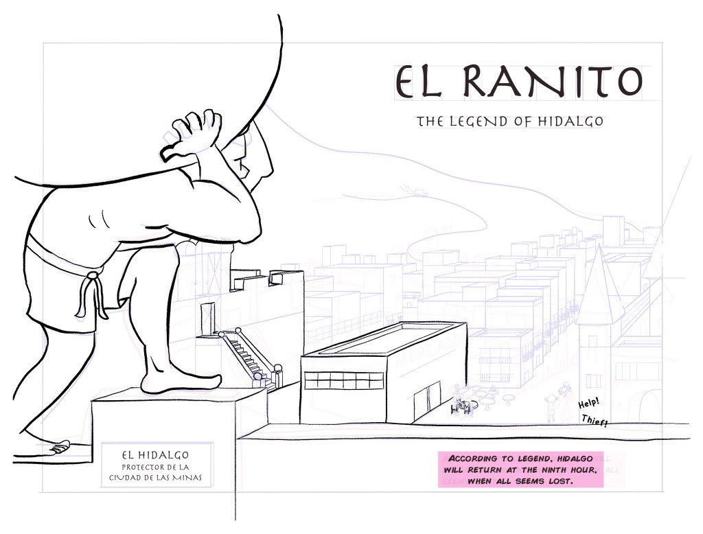
Splash pages and double spreads are used for big moments like reveals, transitions, and emotional climaxes. If they’re used too much, the effect is minimized for all of them.
How many pages in a graphic novel?
The following tables shows the standard page ranges by age and by genre.
| Audience | Page Range |
| Early Readers | 32-64 pages |
| Middle Grade | 80-160 pages |
| Young Adult | 150-250 pages |
| Adult | 180-300+ pages |
| Genre | Page Range |
| Memoir | 200-350 |
| Fantasy/Sci-fi | 200-400+ |
| Romance | 150-250 |
| Mystery/Thriller | 120-220 |
| Horror | 120-200 |
| Humor/Slice of Life | 100-200 |
| Superhero | 120-180 |
(Publishers often prefer pages in multiples of 16 or 32 because books are printed in signatures. Common page counts are 128, 160, 192, 224.)
As writers, we’re used to writing as many words as it takes to tell the story. So, it’s an adjustment to think in terms of pages. But being constrained to 160 pages means you have a visible target, which can be helpful.
How many pages in a chapter?
Like writing a novel in prose, chapter length depends entirely on the author. Where does it make sense to break the narrative? Where can you break it and incentivize the reader to continue?
And like in prose novels, there is a sweet spot where the chapter isn’t too long and fatiguing or too short and disruptive. 15-25 pages is the standard for graphic novels, fewer for younger audiences, and more for older audiences. (A legacy comic book issue is 20-24 pages.)
Panels
Panels measure time in the narrative.
When telling a story, you choose what moments to share. These moments capture important pieces of conversation, action, reaction, emotion, etc. These are turning points for the characters, exact moments when things change. They can be small moments of almost imperceptible change, or big moments with lasting consequence.
The panels of a graphic novel represent these moments within a frame. (Though some can be borderless.) Because they are moments, each moment needs its own panel.
You know it’s time for a new panel whenever there is a jump in time or space. Your character moving from the kitchen to the living room requires at least two panels: one in the kitchen and then one in the living room.
If you want to represent a quick, repetitive movement that occurs in the same location, like a kid, hopped up on sugar, jumping from couch to couch, you can use a single panel. (“Ghosts” of the character jumping and landing can illustrate the chaos.) The space in this instance didn’t change, and the panel measured a timeframe sped up.
You can also slow the movement down and create multiple panels of the kid on different pieces of furniture. This would lose some of the “hopped-up” effect, though.
How many panels on a page?
A good rule of thumb is 4-6 panels per page. This is a comfortable range to read. More panels will slow the pace, and fewer panels will speed things up. (Splash pages and double spreads are impactful and make the reader pause, so use them for big moments and scene setting.)
Graphic novels for younger readers like early readers and chapter books, will have fewer panels that are less complex. Early readers typically have four panels of the same size. Chapter books may have more panels with a little more variability in size and shape. This is because young readers are still learning and will get tired sooner.
Using panels as a narrative tool
As the audience matures, so does the variability in panel layout, and it becomes much more of a narrative tool.
Adding and subtracting panels directly influences pacing like we talked about earlier. Panel borders can indicate dream sequences and flashbacks. The shape of panels can suggest movement and mood. For example, a slanted border can direct the eye quickly to the next panel, connecting the action of both panels to create fluid movement in space. And a tight, skewed panel can make the reader feel uncomfortable, just like the characters are feeling.
Splash pages and half-splash pages can have panels layered on top to show simultaneous action in different locations. This can give a sense of chaos.
Really, once you have a grasp of using panels for changes in space and time, you can get as creative as you want in how you arrange the panels. And if you are the writer, you can leave a lot of the layout choices to your illustrator. But your choice of when to create a new panel will influence how the illustrator interprets your story.
If you’re curious about writing a graphic novel and wonder if it might be something you’d be interested in, I recommend you read my first post: 5 Exciting Reasons You Should Write Graphic Novels For Kids.
Now go ahead, put it into practice. Write a few scenes of a story and organize it into pages and panels. Let us know how it goes in the comments below or in my Substack community space.
Next week’s post will cover dialog. The writer’s super power when it comes to writing graphic novels.
Want to read more original work? Check out my Medium account for flash fiction, personal essays, and articles.
Be sure to subscribe to my newsletter: WITH LOVE, FROM THE FUTURE for more personal letters and updates.
You can find my book recommendations in my Bookshop, Amerixicana Books.
And if you are looking for classic literature for class, or for your home collection, check out my publishing imprint, Simply Classic Books.

Leave a comment